THE opportunity
Soma is an incredible chcolatemaker and after discovering their company, I observed that their current branding and visual identity was not representative of their vison, mission, or culture. As a designer who loves chocolate, I saw an opportunity to dive into a passion project and reimagine the brand.
They already had a strong connection to craft and quality, but I wanted to push that feeling further visually and create a brand that felt more intentional and premium without losing their quirky, creative character. Soma is heavily connected to nature and the source of their ingredients, so I decided to build a visual identity around the natural world where chocolate begins.
THE Concept
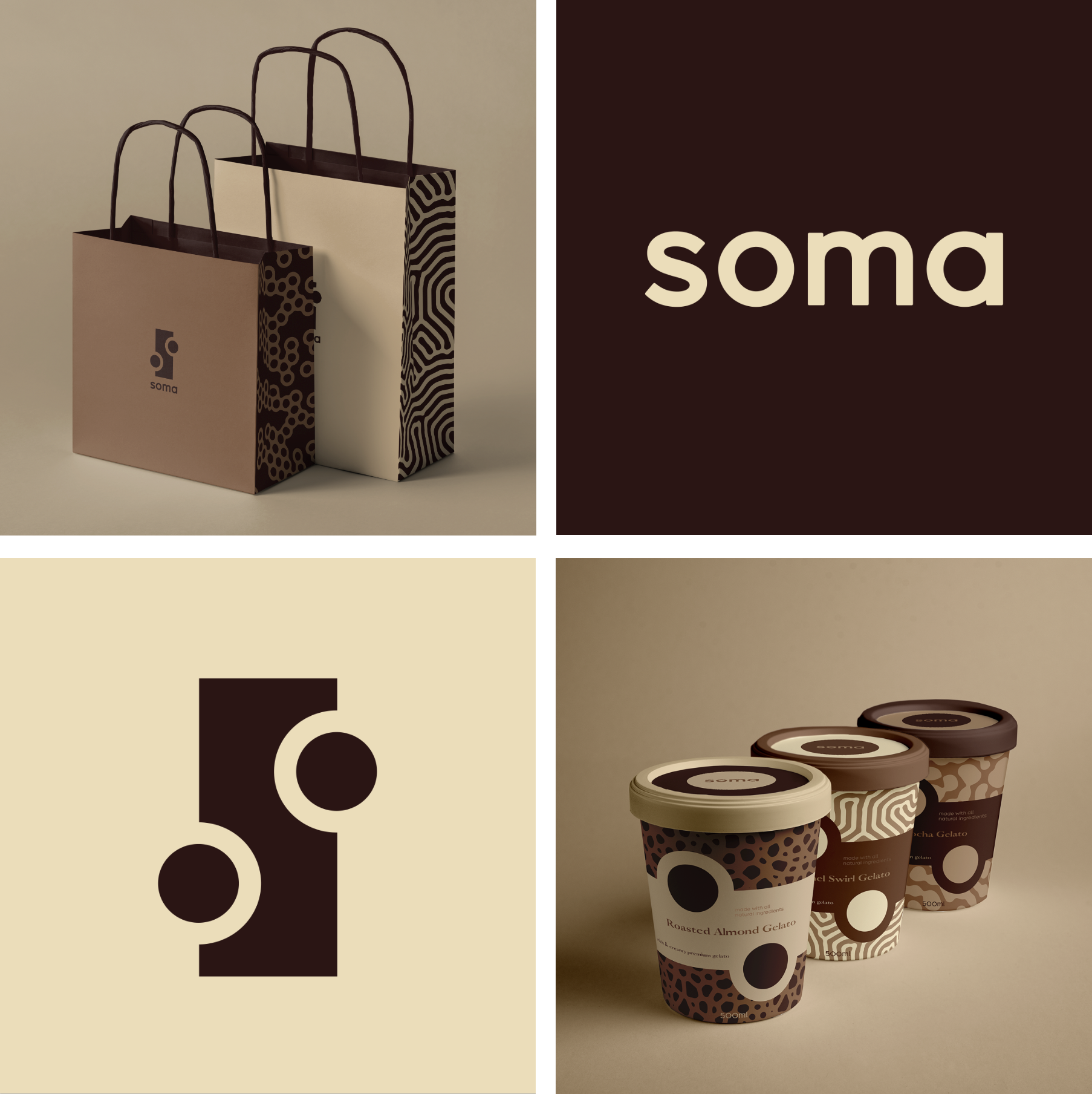
The chocolate-making process begins in the jungle (where cacao beans grow) and I wanted to bring that connection to nature into the visual identity. The concept centred around majestic patterns inspired by the natural world, paired with a rich, monochromatic palette and refined typography. The goal was to create a visual system that felt unmistakably chocolate while still giving the brand a more elevated and sophisticated presence.
Tortor imperdiet sed purus gravida imperdiet elementum morbi faucibus. Turpis eu lobortis mauris sagittis augue neque. Tortor montes ut odio risus scelerisque et venenatis. Aliquam pretium aenean blandit ipsum tellus quis laoreet.
Sagittis luctus metus nisl nibh feugiat ultricies maecenas. Vel blandit ac hac cursus proin adipiscing in diam.Integer a quis pulvinar lectus pharetra nisi fames vulputate.

THE process
From the beginning, I knew I wanted the rebrand to feel unmistakably chocolate. I explored several directions for the logo, drawing inspiration from chocolate in its various forms (solid bars, individual pieces, drops, and other shapes).
I initially envisioned a more muted, colourful palette, but ultimately challenged myself to work in a more restricted palette of solely browns/creams. As someone who naturally gravitates toward using bold, bright colours in design, I liked the idea of removing colour as a tool and forcing myself to create contrast, personality and visual interest through pattern, typography and composition instead.

visual system
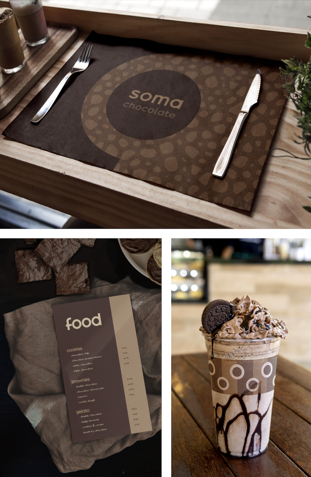
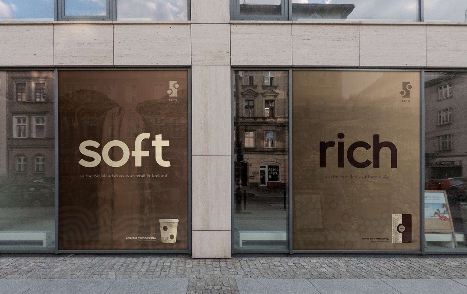
The final identity was built around a collection of twelve distinct patterns inspired by nature, giving the brand a flexible visual language that could be used across packaging, print & digital media, physical spaces, and other assets.
I paired these patterns with contrasting typefaces and a chcocolate-inspired colour palette to create a balance between the natural, tactile qualities of the concept and the more refined direction I wanted the brand to take. The result is a system that feels cohesive without making every application look the same.

THE outcome
The chocolate bar-inspired logo and indulgent brown palette give the brand an unmistakably chocolate essence, while the patterns and typography bring in the more distinctive and playful side of the identity.
The result is a bold, premium brand that balances sophistication with a sense of curiosity and play, creating a visual identity that feels simoultaneously whimsical and elevated.