THE Concept
My client came to me with a clear desire for a campaign that felt bold, colourful, and different from the typical political campaign. He was drawn to the branding of Zohran Mamdani and wanted something in the same vein, while still feeling authentic to his own background and campaign. He is of British origin and requested I incorporate ‘British Racing Green’ into the branding, but otherwise gave me complete creative freedom to develop the visual direction.
Tortor imperdiet sed purus gravida imperdiet elementum morbi faucibus. Turpis eu lobortis mauris sagittis augue neque. Tortor montes ut odio risus scelerisque et venenatis. Aliquam pretium aenean blandit ipsum tellus quis laoreet.
Sagittis luctus metus nisl nibh feugiat ultricies maecenas. Vel blandit ac hac cursus proin adipiscing in diam.Integer a quis pulvinar lectus pharetra nisi fames vulputate.
THE process
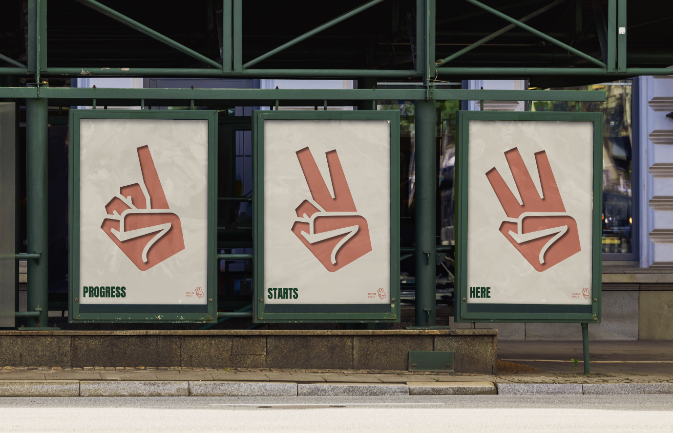
At the heart of the identity is a logo that combines a W, 3, and voting hand, creating a distinctive mark that reinforces the campaign's purpose while tying directly back to the name Ross for Ward 3.
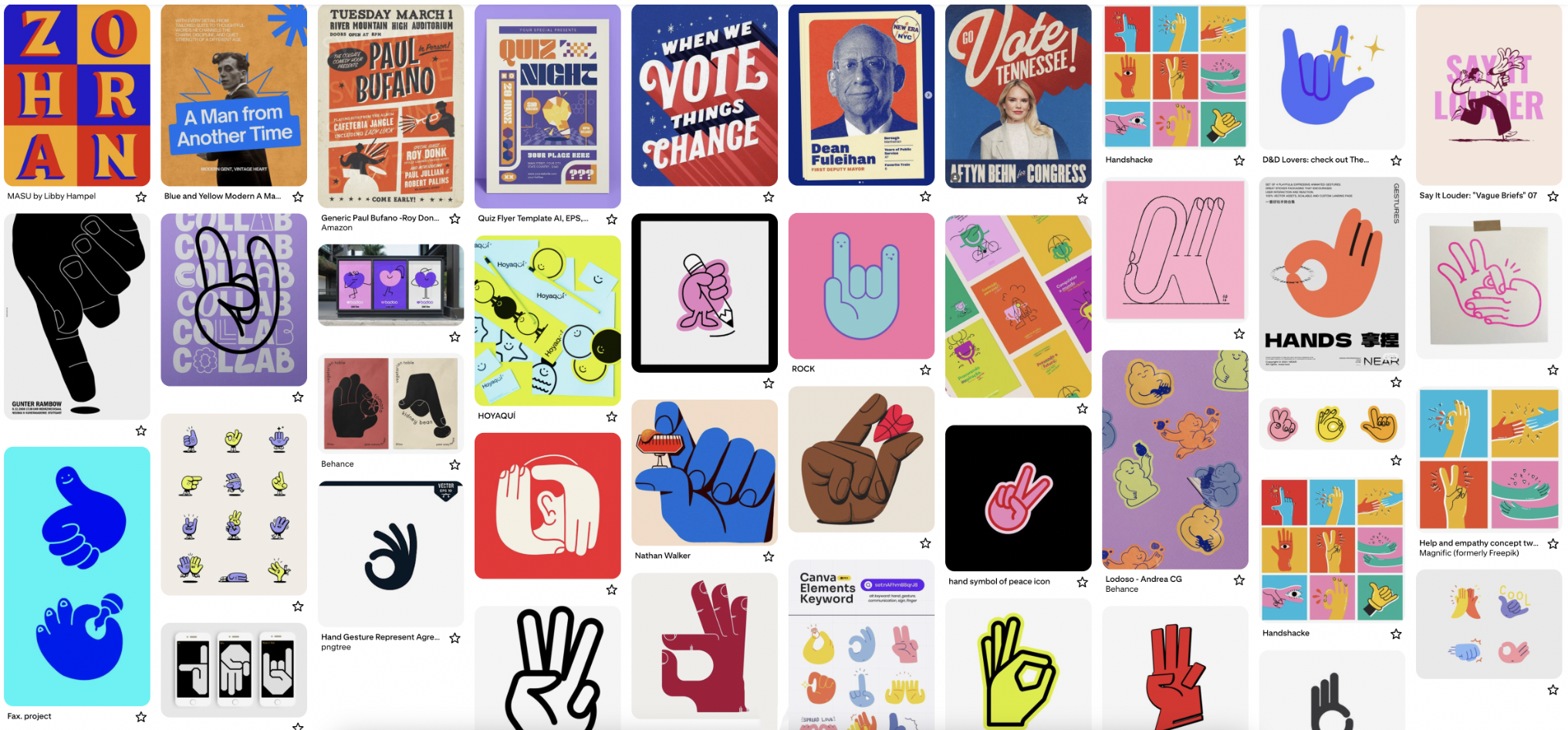
My initial exploration felt a little too soft and almost "bunny-like," so I pushed the form further, developing a stronger, more angular hand shape that better captured the confidence I wanted the campaign to convey. I paired the logo with a strong sans serif typeface that could be used consistently across the campaign materials. The colour palette combines British racing green with salmon pink, symbolizing optimism, approachability, and new beginnings. A soft cream helps balance the palette and adds warmth and sophistication.


the outcome
The final campaign identity is bold, distinctive, and approachable, while still feeling polished and credible. The combination of the custom logo, bold colour palette, and strong typography gives the campaign a recognizable visual language that translates well across everything from campaign signage to social media and fun merchandise. I'm really happy with how the creative direction came together and am looking forward to seeing the identity continues to take shape throughout the campaign.