THE Concept
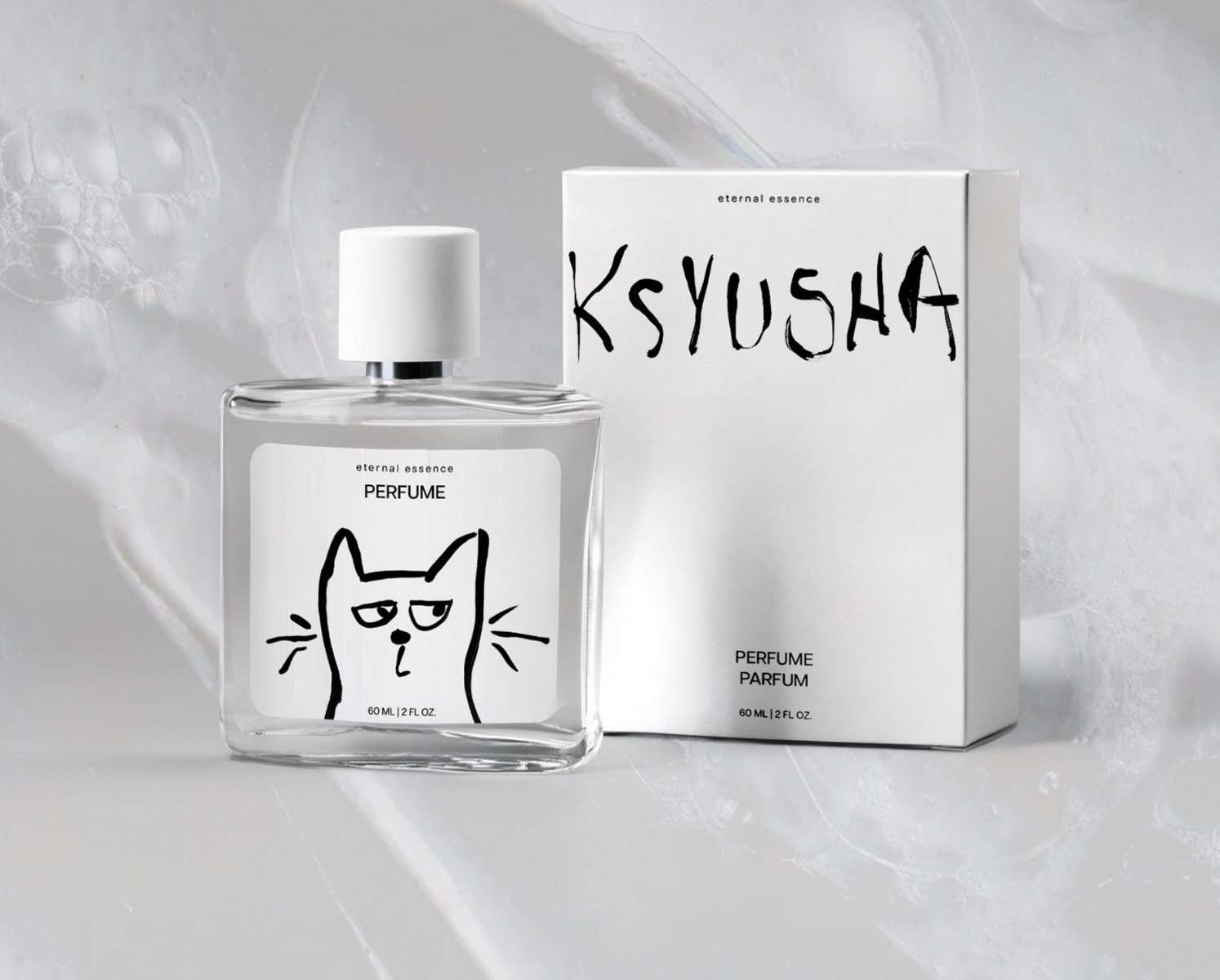
The creative direction for Ksyusha was driven by two things: the handmade, simple nature of the products and the expressive personality of the founder's cat, Ksyusha.
When discussing the origins of the brand, the founder told me that his cat actually played a role in the product development process. Before launching a new product, he would let Ksyusha smell it, and her reaction would help determine whether it got the go-ahead. I found this to be such a unique and memorable part of the brand's story that I wanted to make Ksyusha herself the face of the identity. Rather than treating the cat as a small decorative element, I saw an opportunity to build the visual identity around her personality.
Tortor imperdiet sed purus gravida imperdiet elementum morbi faucibus. Turpis eu lobortis mauris sagittis augue neque. Tortor montes ut odio risus scelerisque et venenatis. Aliquam pretium aenean blandit ipsum tellus quis laoreet.
Sagittis luctus metus nisl nibh feugiat ultricies maecenas. Vel blandit ac hac cursus proin adipiscing in diam.Integer a quis pulvinar lectus pharetra nisi fames vulputate.

THE process
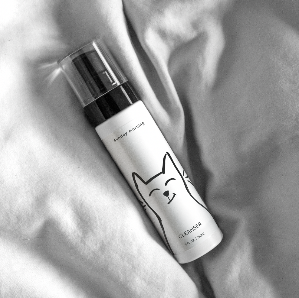
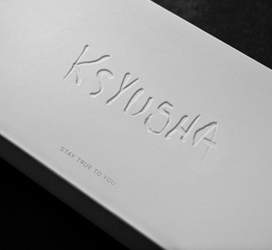
I wanted the identity to feel clean and simple while still capturing the handmade nature of the products. To bring that quality into the design, I developed a hand-painted logotype alongside a series of hand-drawn cat illustrations. I explored numerous iterations of both the cat (experimenting with body shapes, expressions, and personalities) and the wordmark. From these explorations, I selected and refined the elements that felt most authentic to the brand and created the final visual identity.

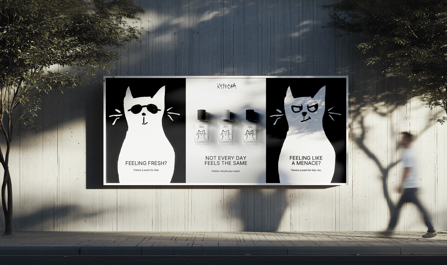
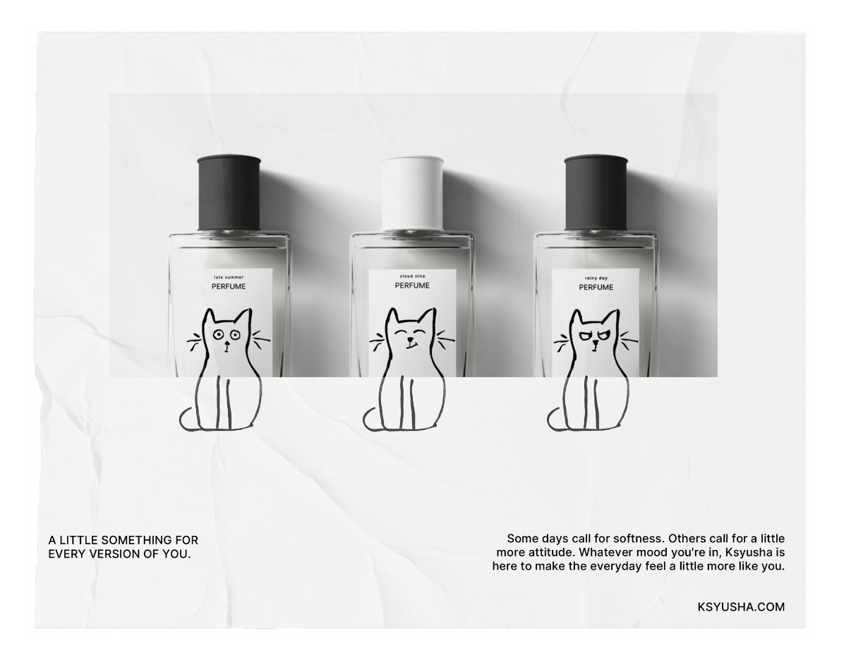
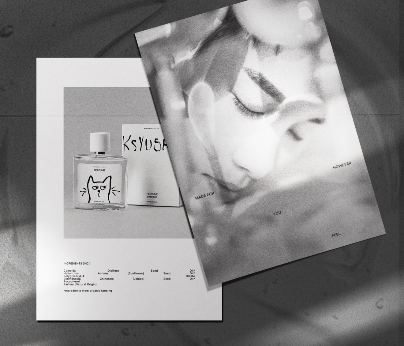
As I began developing the packaging, the cat illustrations naturally became more than just a logo. They became the starting point for an entire visual language. Each expression could represent a different mood or version of yourself, which connected back to the broader message behind Ksyusha: embrace how you're feeling, accept your different moods, and be yourself. This gave me a playful way to differentiate products while still keeping the overall brand cohesive.
the outcome
The final identity is clean and simple, but with a strong personality. The hand-drawn elements and expressive cat illustrations give the brand a distinctive and approachable character, while allowing different products to have their own personality within the larger Ksyusha brand.