THE opportunity
The Hybrid Heart Trail Race is the first event of what the founders hope will eventually become a larger series of athletic events. That meant there was an opportunity to build a brand that could work for the inaugural trail race while also having enough flexibility to grow and evolve over time.
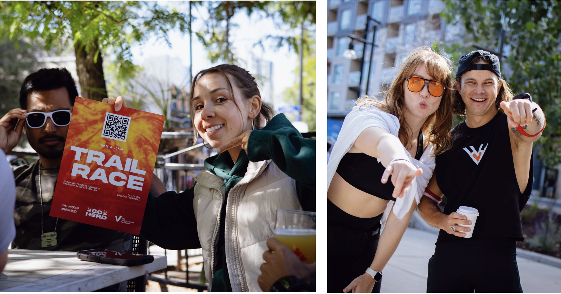
Because I am very involved in the local running community and have a personal connection with the event founder, I was really excited to bring my design experience into a community that I’m already passionate about. I wanted to create something that felt like a legitimate, exciting event from day one, not something that felt thrown together simply because it was a first-year race.
THE concept
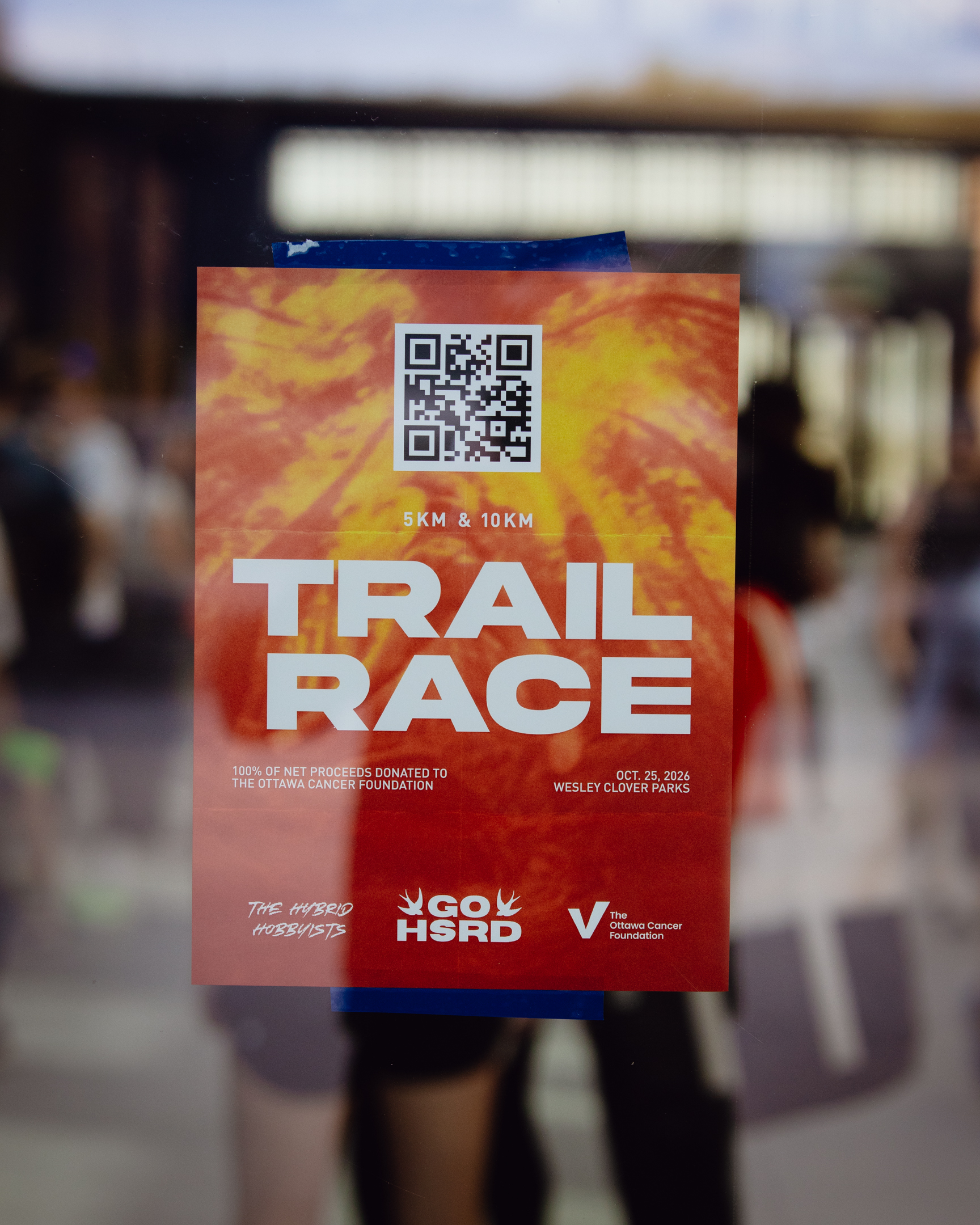
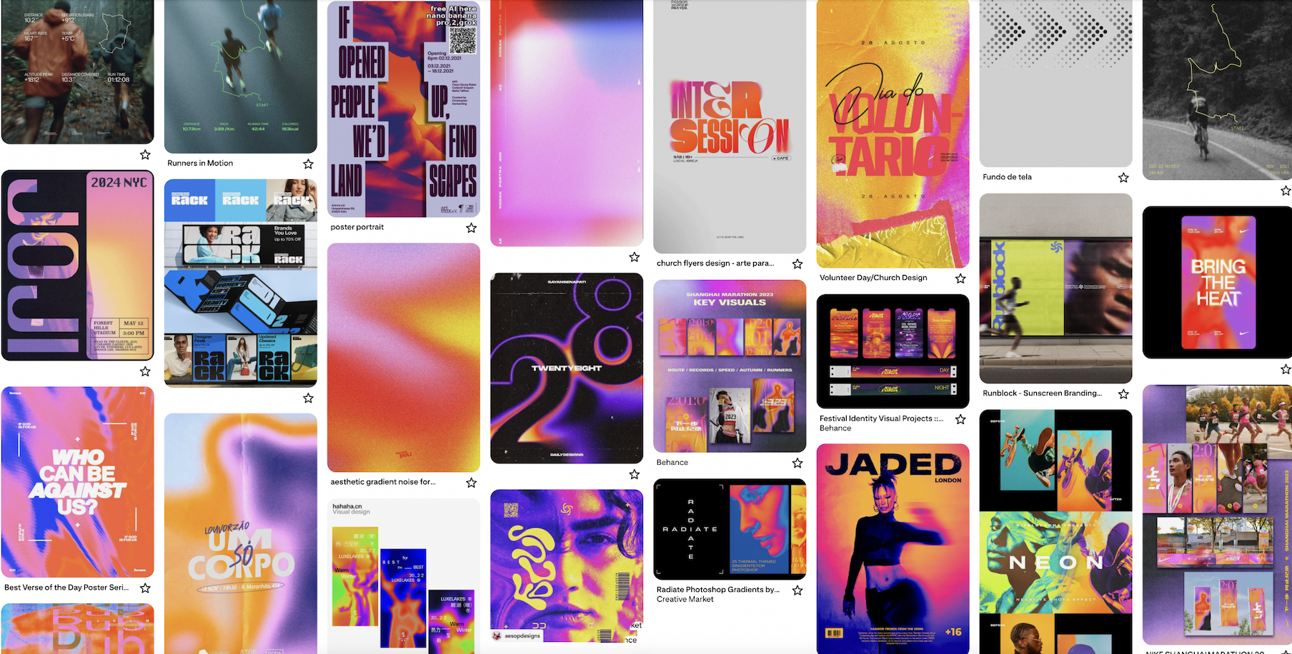
The concept of the visual identity is based around thermal imaging (the idea of body temperature, blood flow, and heartbeats) which felt like a natural connection to both the athletic side of the brand and the meaning behind the Hybrid Heart name. Because the race takes place in the fall, I wanted the colour palette to have a distinctly fall feel. Orange became the primary colour, along with red and yellow accents to create warmth, energy and contrast.
Tortor imperdiet sed purus gravida imperdiet elementum morbi faucibus. Turpis eu lobortis mauris sagittis augue neque. Tortor montes ut odio risus scelerisque et venenatis. Aliquam pretium aenean blandit ipsum tellus quis laoreet.
Sagittis luctus metus nisl nibh feugiat ultricies maecenas. Vel blandit ac hac cursus proin adipiscing in diam.Integer a quis pulvinar lectus pharetra nisi fames vulputate.
THE process
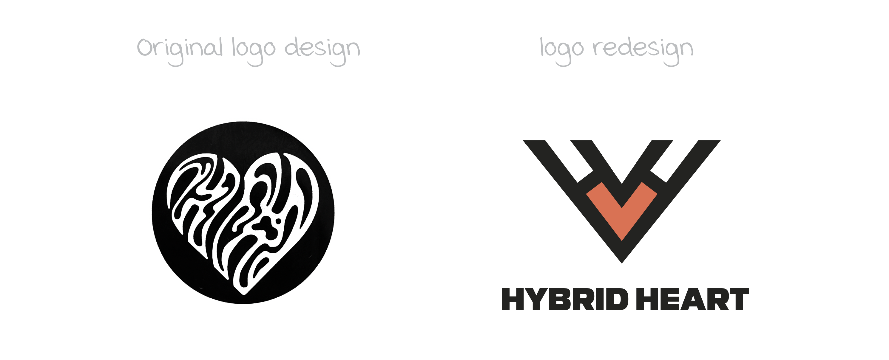
The process began with the logo redesign. When I joined the team, an initial logo had already been developed, but after learning more about the event and its long-term vision, I felt it didn’t capture the personality or purpose of the brand as effectively as it could. We needed something simple, bold and intentional that would make the event feel established and professional while still feeling authentic to the running community.
Since this is the first iteration of the event, I also wanted to build a visual identity that could grow with it. The "hybrid" in Hybrid Heart refers to hybrid athletes, and while the first event is a trail race, the long-term vision is to expand into different athletic events. The identity therefore needed to feel specific enough for the inaugural race without boxing the brand into one type of sport.
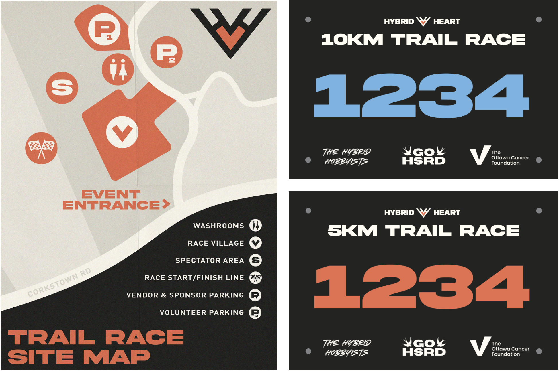
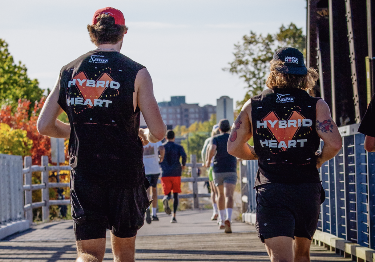
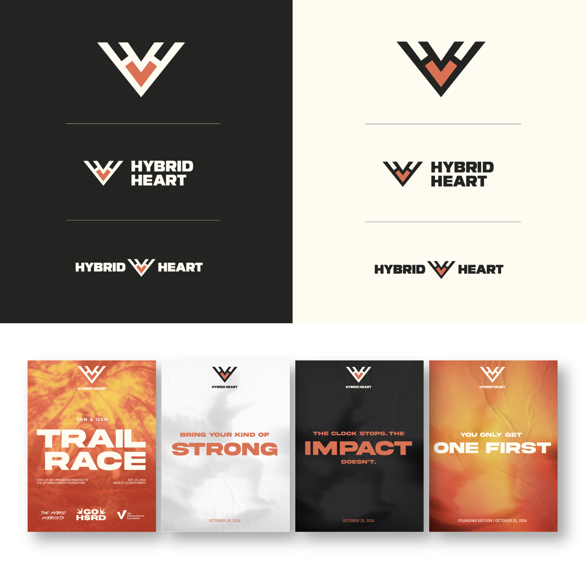
The logo design combines two H's (Hybrid Heart) with an angular heart shape. The symmetrical design also creates the idea of two different sporting disciplines coming together, with the intention of eventually being able to adapt the heart colour and graphics for future events. From there, I developed the broader visual identity using a bold extended sans serif, warm colours, and impressionist imagery inspired by the original thermal-imaging concept. The system was then carried across race marketing, social media, merchandise, signage, and event materials.
THE outcome
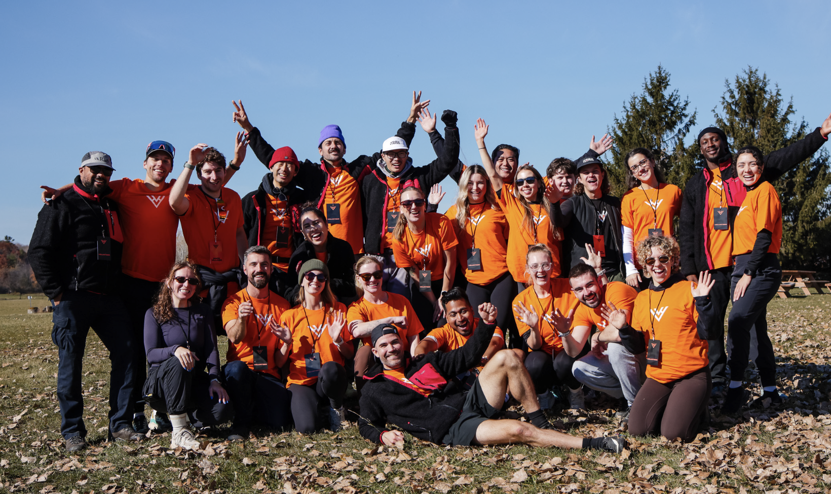
The first Hybrid Heart Trail Race took place on October 25, 2026, and the event could not have gone better – the event raised over $17,000 for cancer and the event/creative direction got incredible feedback.
One of my favourite parts of this project has been being involved beyond just the design itself. I've had the opportunity to collaborate with the event founder, photographers, and other members of the team while helping shape how the event is presented to the running community. Working at the event, I was able to see the identity come to life as both the designer who helped build it and as a member of the community it's being created for.