THE opportunity
The 2025 Canadian Ringette Championships were being hosted in Ottawa and, as a local designer active in the community, I was approached to create the event's logo and visual identity. I was especially excited to take this on because the design of previous championships had been done by volunteer designers – as a professional designer, I wanted to create something that felt more intentional, polished and worthy of a national event.
THE concept
The 2025 CRC identity was heavily inspired by Ottawa itself and the things that make the city distinctive. The Rideau Canal, Northern Lights (Indigenous communities), Parliament, and the tulip all became sources of inspiration. The teal and blue colour palette was also drawn from Ottawa's city flag, helping visually connect the identity to the city.
One challenge I came across was working within new guidelines established by Ringette Canada for the 2025 CRC. The logo was required to use a specific maple-leaf shape, and rather than seeing the restriction as a limitation, I used it as a starting point and explored how I could creatively design an impactful, intentional logo within thier new guidelines.
Tortor imperdiet sed purus gravida imperdiet elementum morbi faucibus. Turpis eu lobortis mauris sagittis augue neque. Tortor montes ut odio risus scelerisque et venenatis. Aliquam pretium aenean blandit ipsum tellus quis laoreet.
Sagittis luctus metus nisl nibh feugiat ultricies maecenas. Vel blandit ac hac cursus proin adipiscing in diam.Integer a quis pulvinar lectus pharetra nisi fames vulputate.

THE process
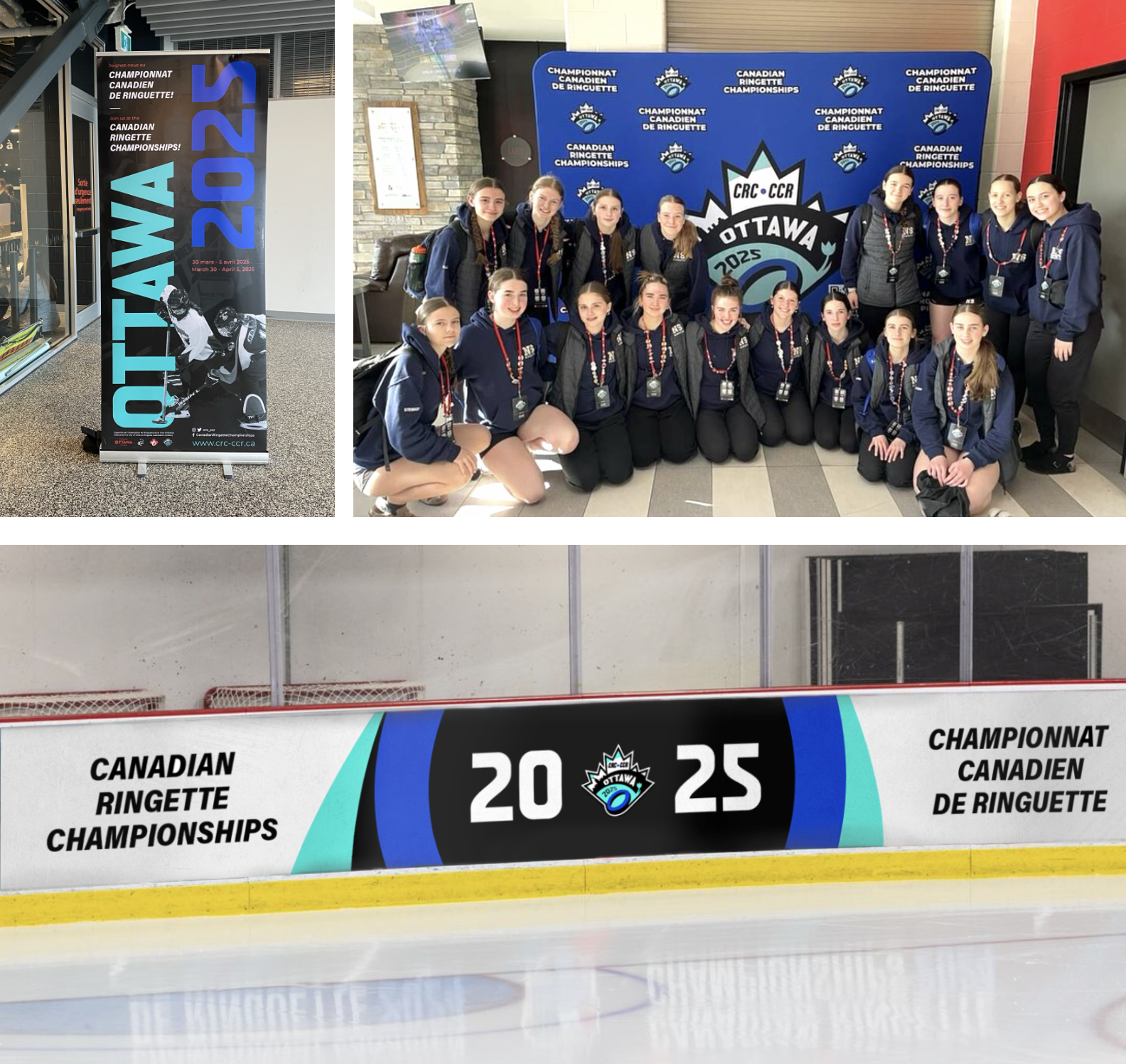
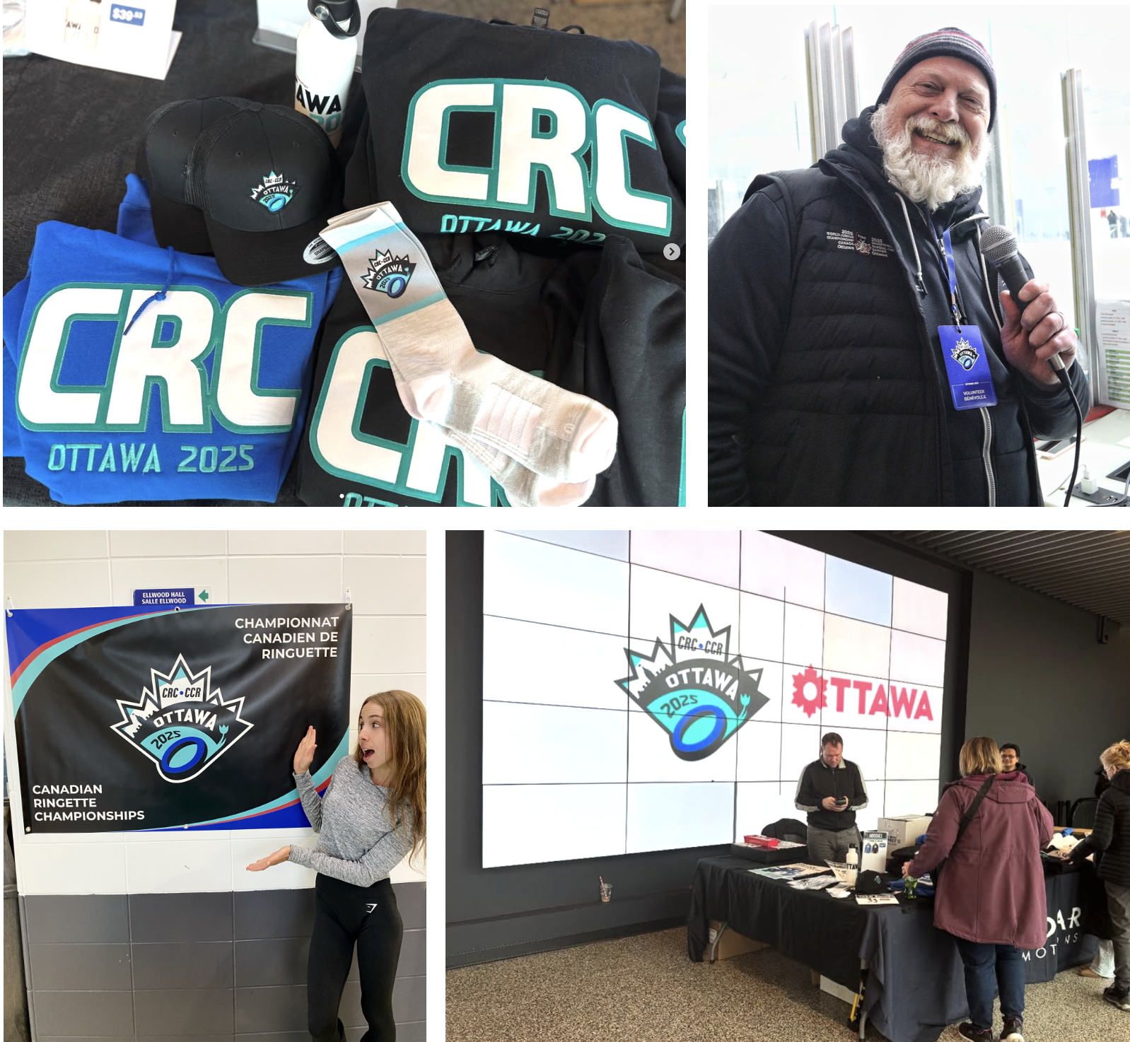
Once the logo was approved, I wanted to extend the concept into a complete visual identity rather than treating the logo as a standalone design. I developed the creative direction for the championships across marketing materials, merchandise, print and digital media, and other event applications.
Because the event involved so many different touchpoints and audiences, consistency was very important to me, however not every application was executed exactly as I had envisioned. Due to organizational decisions and responsibilities being shared across the event team, several design elements were not designed as I had hoped, but I was involved in the broader creative direction and am very proud of how the identity came together for the event.

THE outcome
The response to the creative direction was incredibly positive. Athletes, coaches, parents, and members of the public consistently commented on the visual identity, how professional it looked, and how well it represented Ottawa as the host city. It was so well received that Ottawa was selected to host the Canadian Ringette Championships again in 2026, and I was invited back to lead the creative direction for a second consecutive year. That gave me the opportunity to take everything I learned from the first event and approach the next identity with even more creative freedom.
crc 2026
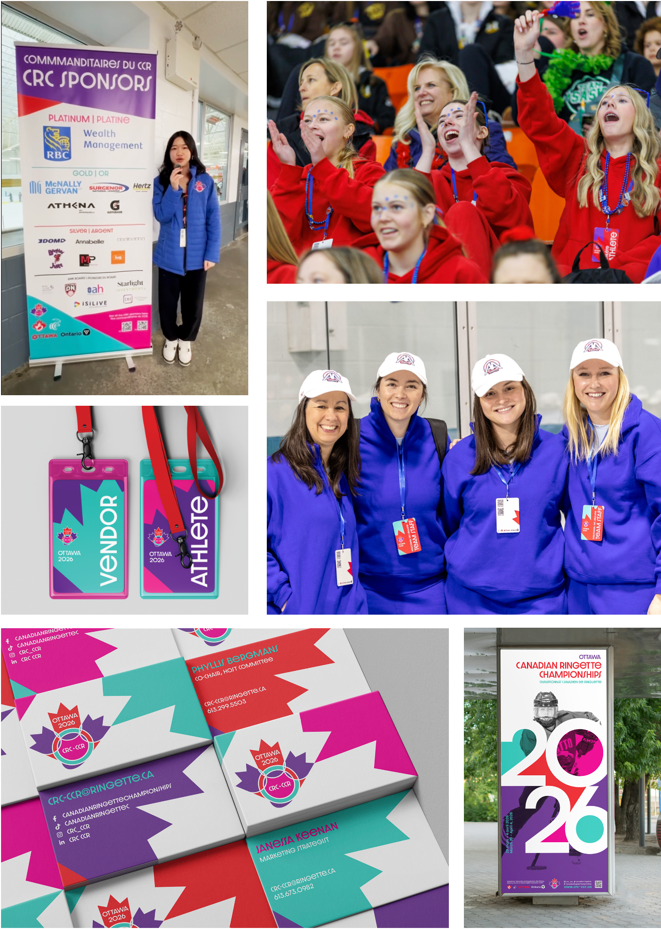
With Ottawa hosting the CRC again in 2026, I was brought back to lead the creative direction for the second consecutive year. After developing a relatively intense, sporty, and Ottawa-focused identity for 2025, I wanted to take a completely different approach this time around; I wanted the visual identity to feel fun, energetic and playful, while still feeling aligned with a national sports championship.
The 2026 logo still incorporated subtle references to Ottawa, but in a much more abstract way. Three tulip shapes, intersecting a ringette ring reference the city and the sport, while also creating the silhouette of a girl's head and hair – a nod to both the event and the young female athletes who are at the heart of ringuette as a sport.
From there, I expanded the identity with a vibrant colour palette, a distinctive typeface, and bold graphic elements. The result was a visual system that felt energetic and playful while being cohesive across the event's applications.


crc 2027
CRC 2027 will will be hosted in Halifax, Nova Scotia, and after seeing my work for the previous two championships, the organizing committee reached out and invited me to lead the creative direction once again. Although I'm not a local designer in Halifax, I was excited by the opportunity to approach the identity from a completely different perspective and explore what makes the city and region unique.
The creative direction we’re taking this year leans into Halifax's coastal vibes and welcoming atmosphere. Nautical references, the city's connection to the sea and the iconic lighthouse landscape inspired the logo design and visual identity. A softer colour palette, Nova Scotia tartan-inspired patterns, and a unique typeface help create a direction that feels distinctly East Coast while maintaining a sporting event feel. �
The brand guide is still being finalized, and additional applications will be excecuted over the coming months which I am very much looking forward to.